


воскресенье, 24 июля 2016 г.
Using Modern CSS to Build a Responsive Image Grid
Building custom responsive layouts is always exciting. This article examines a technique that we can use to take full control of the distance between grid columns. To demonstrate this, I’ll use the example of a responsive image gallery.
Building a Responsive Layout
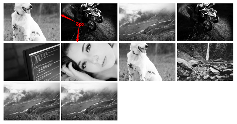
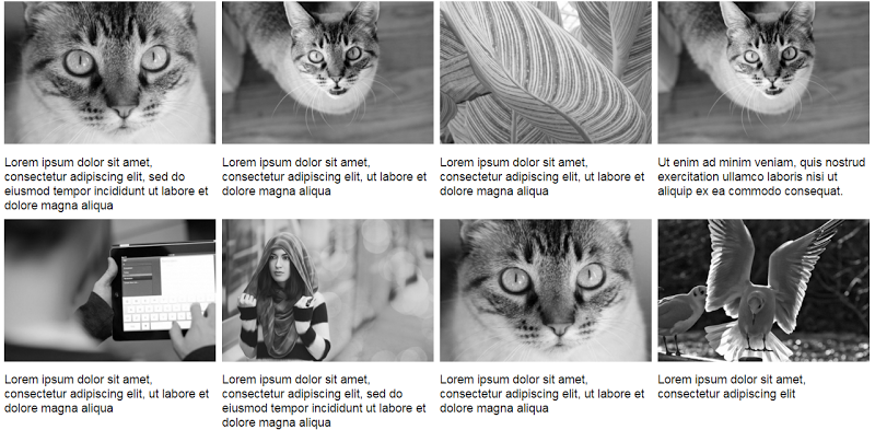
To begin with, let’s assume on large screens our gallery should look something like this:
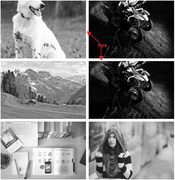
On smaller screens (i.e. <50em), it should have the following appearance:
The markup is simple:
<div>
  <a href="path-to-the-image">
    <figure>
      <img src="path-to-the-image" alt="">
    </figure>
  </a>

  <!-- other anchors here ... -->

</div>
As you probably already know, we can take advantage of different layout methods for generating the desired result. Before I examine two of those possible methods, let’s take note of our initial requirements (see previous visualizations):
- I want a 2-column layout on medium screens and smaller (i.e. <50em), and a 4-column layout on large screens (50em or above).
- The distance between columns should be 8px.
Using inline-block
I’ll first use the
display:inline-block method to build our gallery. Consider the following CSS:div {
font-size: 0;
}
a {
font-size: 16px;
display: inline-block;
margin-bottom: 8px;
width: calc(50% - 4px);
margin-right: 8px;
}
a:nth-of-type(2n) {
margin-right: 0;
}
@media screen and (min-width: 50em) {
a {
width: calc(25% - 6px);
}
a:nth-of-type(2n) {
margin-right: 8px;
}
a:nth-of-type(4n) {
margin-right: 0;
}
}
Here’s an explanation of what I’ve done:
By default, there’s a space between
inline-block elements. One way to override this is to set the font size of the parent element to zero. This might also require that we reset the font size of any child elements (not necessary in our case).
On small screens I have a 2-column layout and I specify 8px of space between columns.
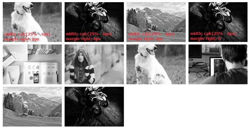
The width of our columns is calculated as follows:
- Total space between columns per row = 1 * 8px => 8px. The derived value is 8px and not 16px because I remove the right margin for every second column on small screens.
- The width of each column = calc(50% – 4px). The value 4px derived by calculating: Total space between columns per row / Number of columns per row (8px / 2 => 4px).

On large screens I have a 4-column layout and I specify 8px space between columns. So, the width of our columns is calculated as follows:
- Total space between columns per row = 3 * 8px => 24px. Again, the derived value is 24px and not 32px because I remove the right margin for every fourth column.
- For column widths, I’m using calc(25% – 6px). The value 6px derived by making this simple calculation: Total space between columns per row / Number of columns per row (24px / 4 => 6px).
Using Flexbox
The solution above works pretty well, but there are some disadvantages. To demonstrate one disadvantage, let’s assume that each image contains a caption as well.
Consider this slightly updated markup:
<div>
  <a href="path-to-the-image">
    <figure>
      <img src="path-to-the-image" alt="">
      <figcaption>Some text here</figcaption>
    </figure>
  </a>

  <!-- other anchors here ... -->

</div>
Here’s the new version of our gallery on large screens:
The result isn’t so attractive because the grid items have different heights. We can fix this with flexbox, a modern layout method, which will allow us to overcome many common layout problems (e.g. default gap between
inline-block elements). In order to activate this method, I simply have to update the CSS of the parent element (the flex container):div {
display: flex;
flex-wrap: wrap;
}
Happily enough, if we now preview the gallery, we’ll get the expected result (i.e. equal height columns) across all screens. Here’s how it looks on large screens:
At this point, there’s one last thing I have to clarify. Flexbox provides the
justify-content property that aligns flex items along the main axis of the current line of the flex container. However, note that this property doesn’t define a value that will allow us to build the desired gallery layout. For example, the space-between value results in this layout: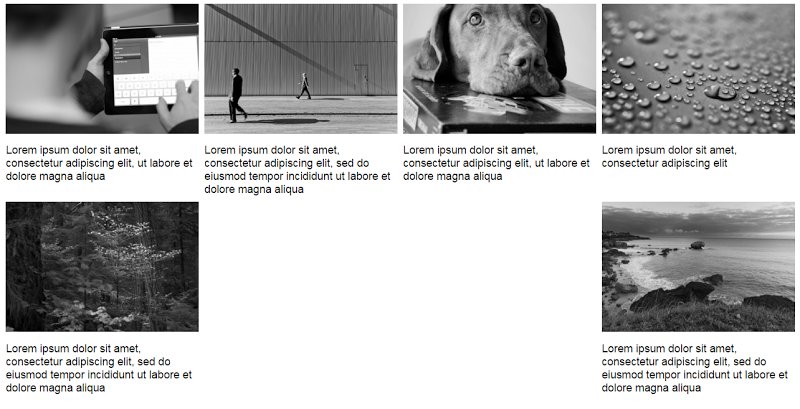
While the
space-around property results in this one: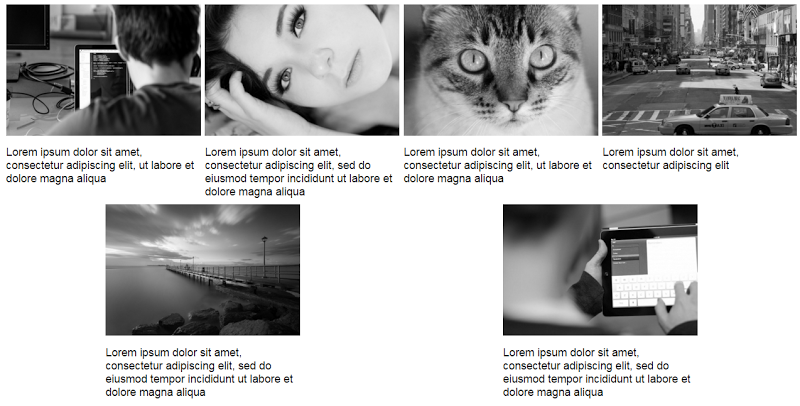
In both cases, the last two items are distributed awkwardly on the final row. The CSS for this method would look like this:
div {
  display: flex;
  flex-wrap: wrap;
  justify-content: space-between; /* or space-around */
}

a {
  display: inline-block;
  margin-bottom: 8px;
  width: calc(50% - 4px);
}

@media screen and (min-width: 50em) {
  a {
    width: calc(25% - 6px);
  }
}
In this case I didn’t assign a
margin-right property to the flex items. This happens because, depending on the value of the justify-content property, the browser takes care of distributing the flex items across their container.More from this author
Conclusion
This post has covered a couple of techniques for controlling the distance between grid columns in a responsive image grid. While the inline-block method is sufficient, flexbox makes it much easier and more convenient, especially when combined with the
calc() function.
If you have another solution to this problem, feel free to mention it in the comments.
https://www.sitepoint.com/using-modern-css-to-build-a-responsive-image-grid/


0 коммент.:
Отправить комментарий